
BUSINESS OBJECTIVE 📈
Background
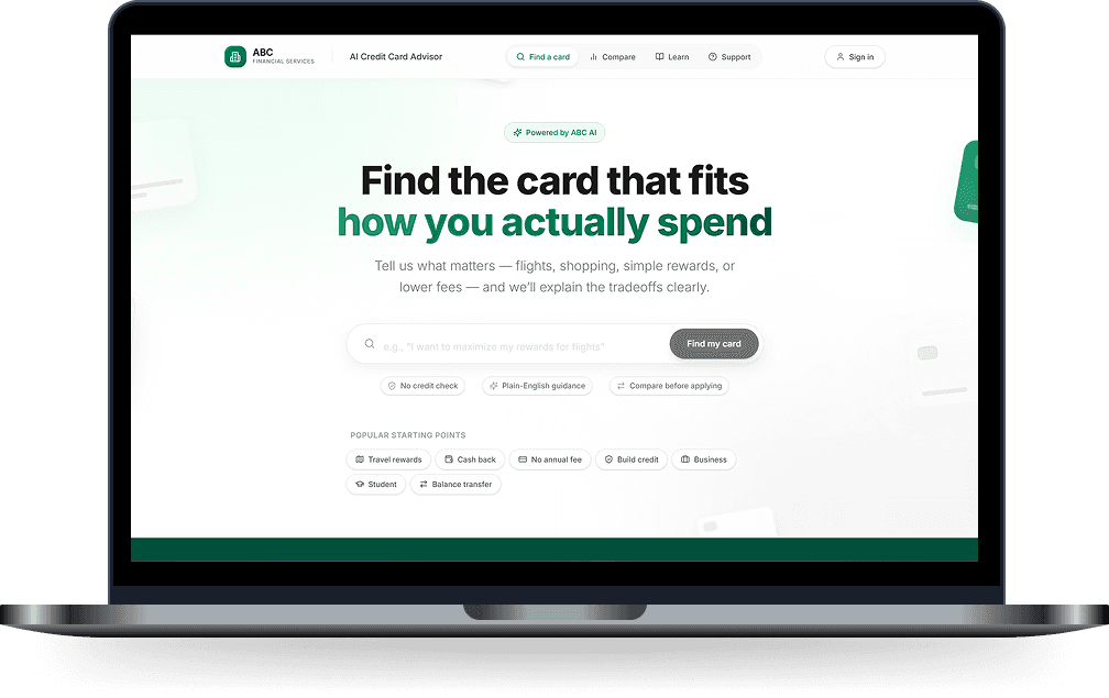
Most credit card websites expect users to already know what they want.
This concept redesigns the experience around guided decision-making: users answer a few preference-based questions, receive an AI-generated summary, compare recommended cards, and choose the card that fits them best.
MY ROLE 🙋♀️
What'd I do?
Role: UX Researcher & Product Designer
Focus: Fintech UX, AI recommendations, comparison design, decision support
Tools: Figma, Figma Make, UX research, prototyping
Project: Client project (hence the removal of their logo and any recognizable branding)
What challenge did I face?
The Challenge
Credit card selection with comparison and personalization is overwhelming 🫤
What'd I deliver?
The Solution
Turning card discovery from a generic browsing experience to a guided selection process 💚
The goal for this design sprint
Understand what type of card fits their lifestyle;
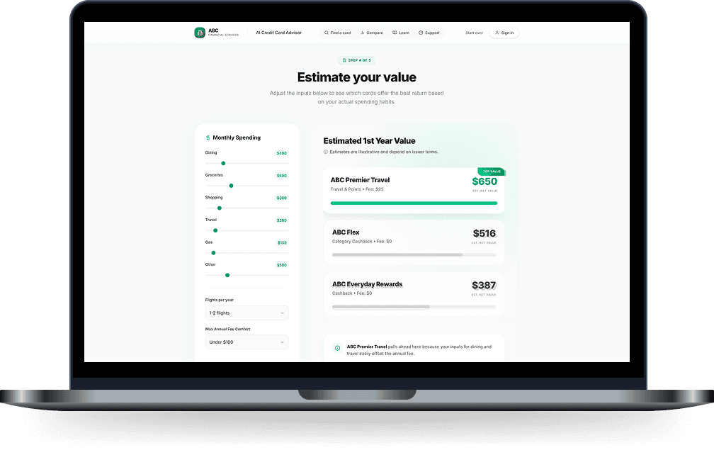
Compare cards without reading dense financial tables;
Trust why a card is being recommended;
Move from uncertainty to selection with confidence
Page Walkthrough
What are the Key Design Decisions I took? 👀
1 of 4
A sneak peak!
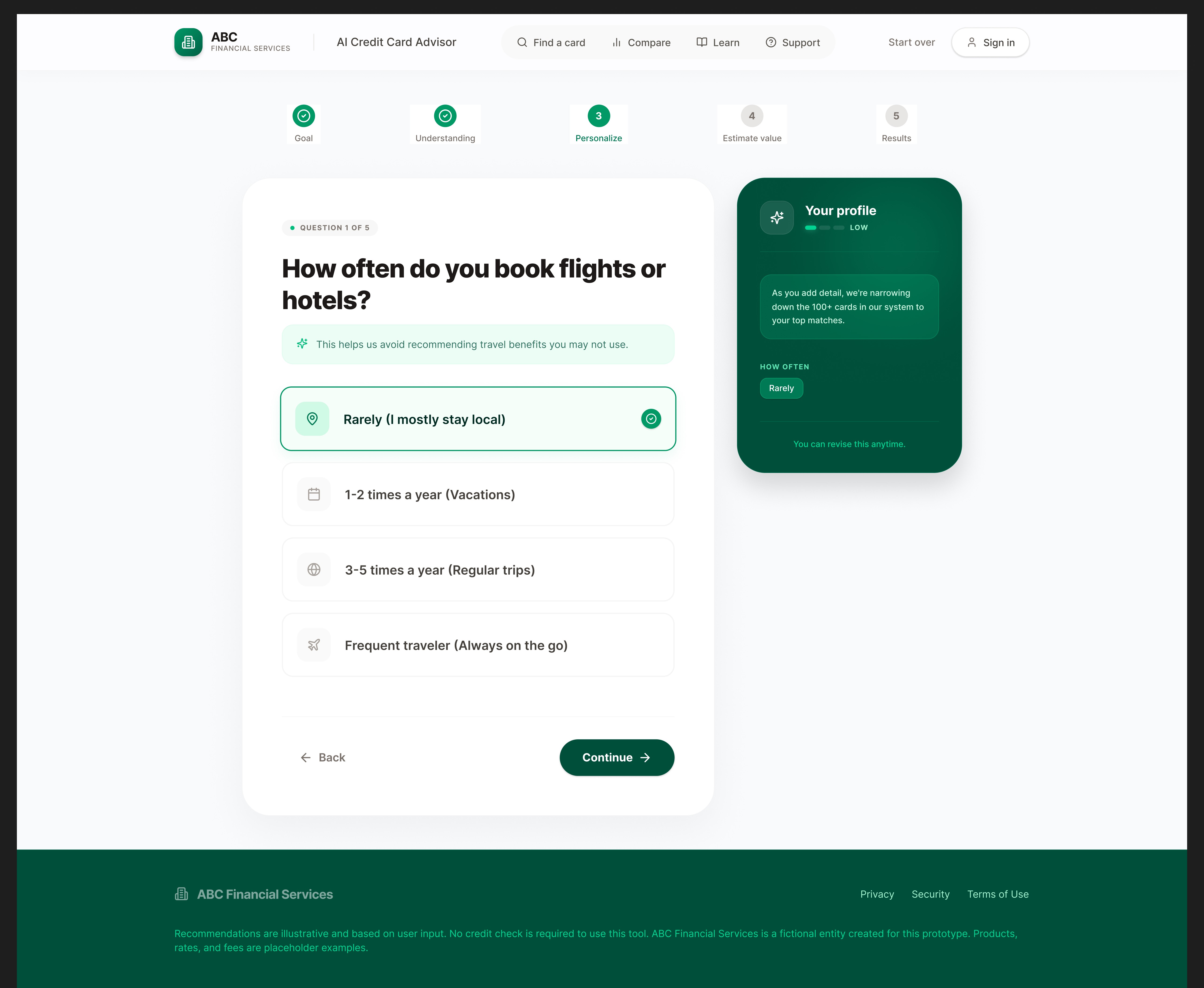
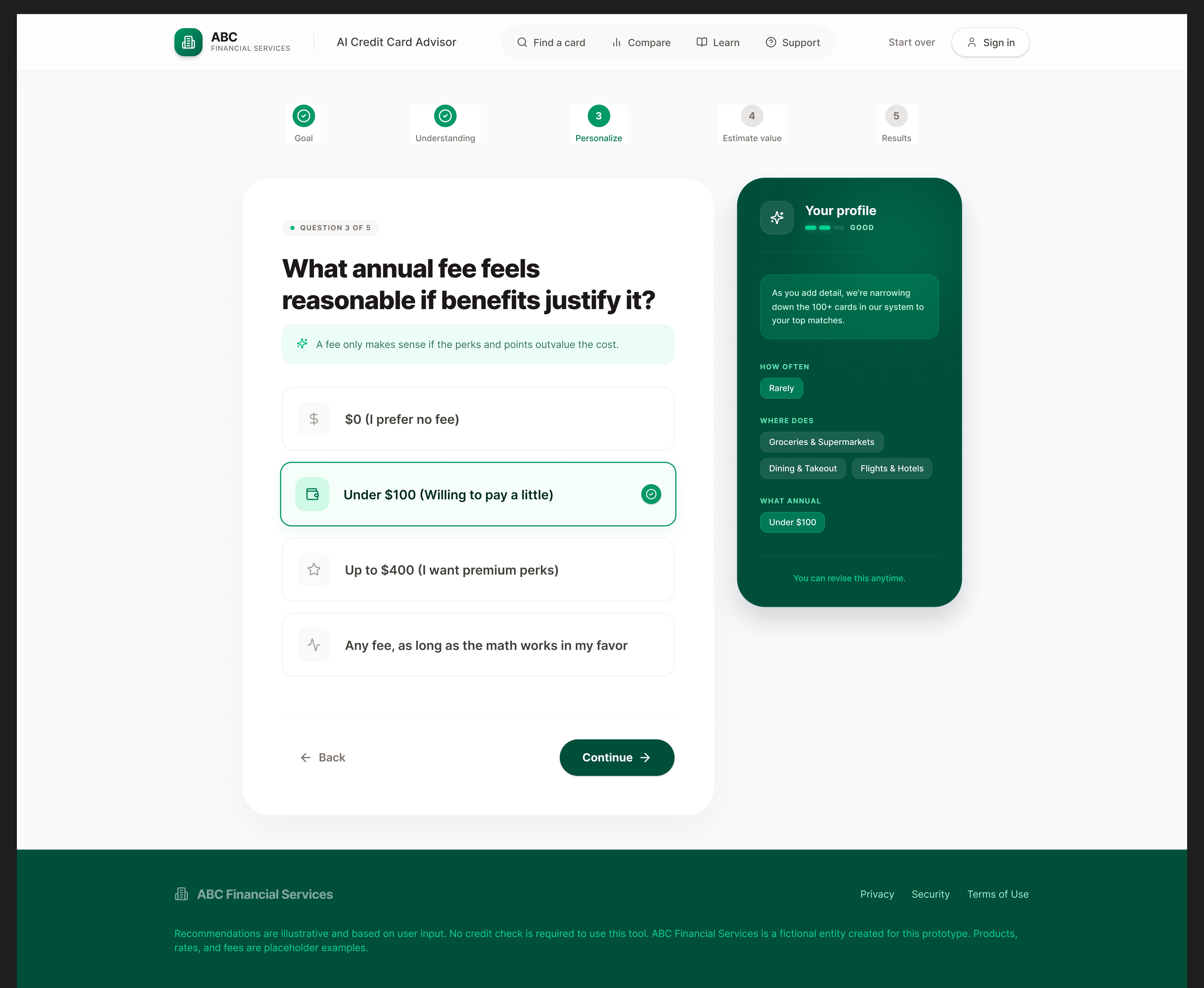
☘️ Before showing cards, the interface summarizes the user’s preferences so they can confirm the system understood them.


2 of 4
🔎 Each card includes a short explanation of why it fits the user instead of only showing a match score.


3 of 4
🎨 Users can compare shortlisted cards before making a decision, which makes the flow feel less pushy and more trustworthy.


4 of 4
🎨 The interface shows the most important details first, while deeper card terms are available when users need them.


How'd the Design Evolve? 📄
Content creation
🔤 The design started as a simple card browsing experience but evolved into a guided decision flow. Early screens focused more on displaying available cards.
🗯️ As the product direction became clearer, the flow shifted toward collecting user preferences first, then using AI to summarize and recommend cards.
The impact of my designs
💥 This made the interface feel more useful because the user was no longer expected to manually interpret every card option.
However there were challeges too!
User testing
What Challenges did we face?
Credit Card Problems
Balancing simplicity with trust
Credit card products require detailed information, but showing everything upfront would make the interface feel heavy.
Credit Card Expectation - 1
Use Progressive Disclosure
Show the recommendation, key benefits, and reasoning first, then let users open detailed comparisons when needed.
Credit Card Expectation -2
Make AI suggestions feel credible
To solve this, the design avoids vague AI language and instead connects each recommendation directly to the user’s stated preferences.
Detailed Web-Pages 📚
Page Walkthrough
Landing Page

Step 2
Step 4
Step 6

Step 8

Comparison Page

Step 1

Step 3

Step 5

Step 7

Step 9

Knowledge Center

Results 🧨
The final concept turns credit card discovery from a generic product-browsing experience into a guided selection process. It helps users understand their options, compare relevant cards, and make a more confident decision before applying.