

Brew - The Unofficial Lipton Design System
OVERVIEW
What was this based on?
Lipton, a global leader in tea and wellness beverages, offers a range of products celebrated for their quality and simplicity. Their online presence showcases vibrant imagery and rich visuals but currently lacks a scalable framework to support consistent, accessible design.

PROJECT TYPE
It was a class project!
A Design Systems class project under the supervision of Mr. Craig MacDonald
Collaborators - A team of 4 UI Designers
Duration - 9 weeks (January - May 2025)
MY ROLE
What'd I do?
Website Deconstruction
Identified Inconsistencies Design System Development
Documentation
BUSINESS OBJECTIVE
What did we plan to do?
Create a unified, WCAG-compliant design system that speeds up feature and version delivery and cuts Lipton's predicted repetitive maintenance costs, while ensuring brand consistency and boosting user engagement and conversions.
Lipton Strengths
Lipton's website has great visuals!
Strong and consistent images and colors across the website that convey the brand’s wellness-centered values.


However…we found multiple issues with this website…
Lipton Problem Set 1
Multiple component styles, Inconsistent spacing and layouts
Visual inconsistency across pages created a disjointed brand experience.

Lipton Problem Set 2
Conflicting component behaviors
Similar actions employ different button treatments (ghost, solid, text) and unpredictable hover/active states, confusing users.

Lipton Problem Set 3
Accessibility Challenges
Tab navigation breaks in key areas, filters lack labels and focus indicators, and overused brand yellow fails WCAG contrast thresholds.

Have a look at some of our major painpoints
It all started with us noticing the combo of white text and yellow bg
Despite having perfect eyesight, I still struggled to read that page and spotted numerous issues—so we chose to focus on Lipton.
3
White text on Yellow background

15
Button Styles & Inconsistent colors

∀
Spacing and Layout
Felt the process of locating the desired NPO could be more efficient

Target audience
Our primary target audience became the designers of Lipton; Secondary - tea consumers
Guided by Professor MacDonald’s sessions, we simplified design updates to eliminate rework and deliver a seamless experience for tea shoppers.
Our approach
Problem Statement
After the initial lay of the ground, this is the problem statement catering to the design team of Lipton
How might we create a cohesive and accessible design system for Lipton’s designers, engineers, and their consumers to ensure consistent branding, faster updates, lower maintenance, and an inclusive user experience?
What
Who
Why
Solution
Introducing the Brew Design System for the Lipton Designs!
Consolidated Color Palette for Clarity and Accessibility - 3-color palette with shades, WCAG-tested for contrast to ensure consistency and hierarchy.
2 button levels—primary, secondary—with unified styles for clear hierarchy.
Labeled tabs, clear hover/active states, and intuitive submenus for improved navigation.
Unified cards with consistent radius, shadows, and typography for visual harmony.
Comprehensive Guidelines and Documentation - From token definitions to component usage, our Zeroheight docs include principles, code snippets, and best practices, turning a simple UI kit into a living system.
Why should Lipton use our system?
Key features of the Brew Design System!
An inconsistent Before and a simply laid out After!

Customization with Tokens and Variants


Reduced Colors with WCAG Contrast Standards


Now, let me walk you through the entire process from start to finish.
We as a team came to the conclusion that the best thing would be to ensure we do not stray from Lipton's current brand system
We plan to keep -
This was because they based their brand on wellness, calm, and vibrant nature and that represented who they were as a company so much that changing that seemed like stripping them of everything they believe about.
How did we go about this?
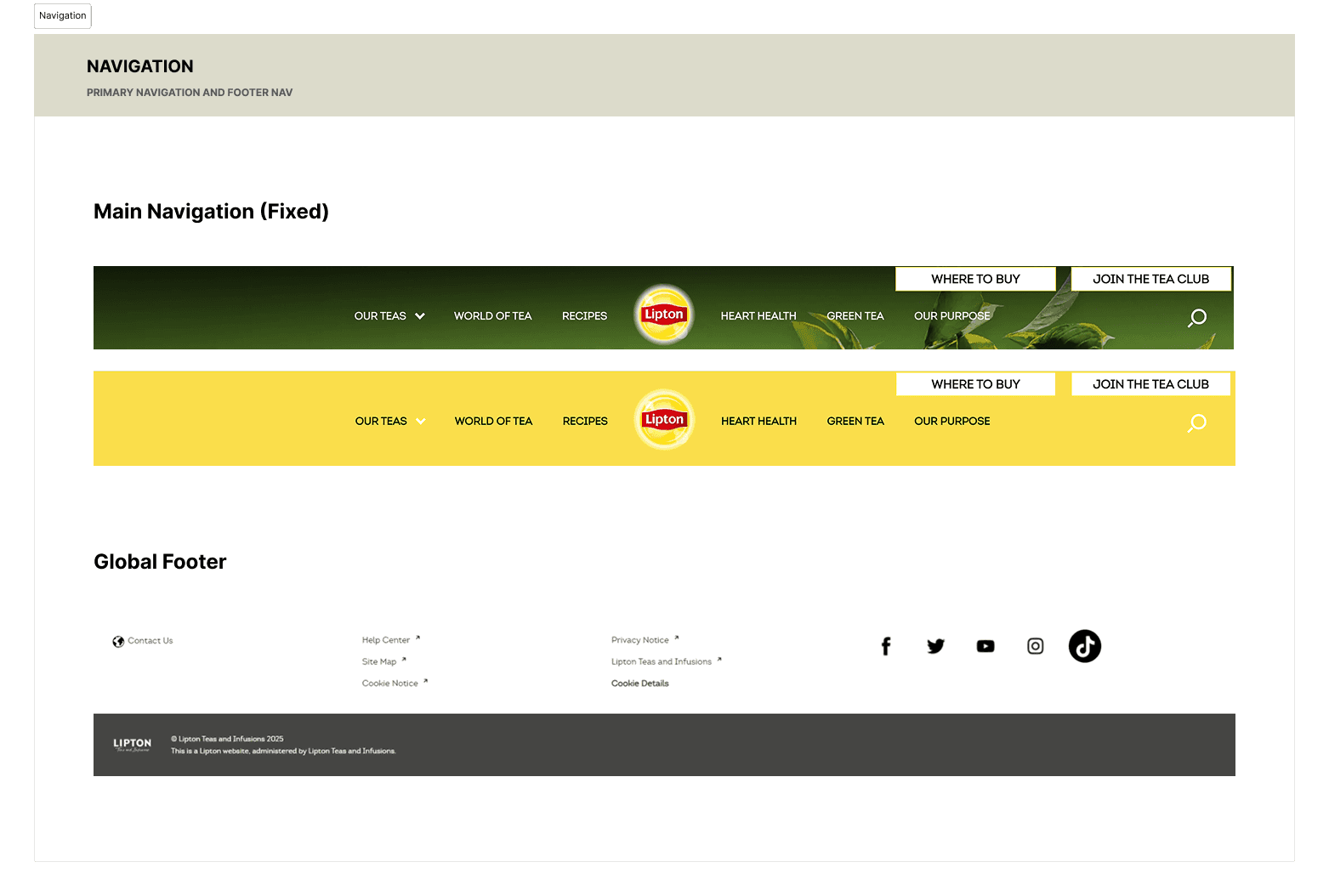
We first focused on Deconstruction & Heuristic Audit
We conducted a full UI inventory of Lipton’s website—cataloging colors, typography, icons, components, navigation and page templates in Figma.
Why we did it: To surface every instance of inconsistency and gather a “single source of truth” for our audit.
Outcome: Identified over 10 unique button styles, seven font families, and multiple filter–date picker variants that violated common usability heuristics!


Insight synthesis
Next, we consolidated the insights we gathered from each of the website’s defined design sections.
What we did: Mapped audit findings into eight core insights—ranging from typography and spacing issues to overreliance on large imagery.
Why we did it: To prioritize areas with the biggest impact on user experience and brand clarity.
Outcome: A clear opportunity framework that guided our next steps, ensuring we tackled the most critical pain points first.


Going back to foundations
To make sure we were on the right path, we re-defined our design values & principles

Efficiency

Inclusivity

Minimalism
Solution
Then, we started small, building our foundational Atoms!
What we did: Built five “foundations” pages in Figma consisting of:
Colors: WCAG-tested neutral, primary (greens), and secondary (yellows) scales
Typography: Single hierarchy—Open Sans for headings, Lato for body and labels
Spacing: 4 px root scale with Small/Medium/Large umbrellas, each with usage guidelines
Grid: Responsive 4–12 column layouts with clear margin/gutter rules
Icons: Unified 50-icon set with consistent stroke and alignment
Why we did it: To create a single source of atoms that enforces consistency and accessibility throughout the molecules and components.
Outcome: A token library that reduced design decisions to selecting from a predefined, brand-aligned palette.


Me and my team brainstorming atoms!
User testing
Later, we went ahead and built a molecule-driven component library to ensure visual consistency.
What we did: Built 17 component pages in Figma—Banner, Buttons, Cards, Carousel, Forms, etc.—and published complete usage guidelines, accessibility notes, and code snippets in Zeroheight.
Why we did it: To empower both designers and to an extent engineers with clear, ready-to-use patterns that eliminate guesswork.
Outcome: A living system where every component is documented, tested, and easily implementable.
Banner
Buttons
Cards Hierarchy
Carousel
Checkboxes
Strokes
Filter
Feedback Form
Header & Footer
Target Texts
Icons
Images
Lists
Rating Scale
Drop-down Suggestion
Text Input
Live Examples
A round of user testing
Post the creation, it was user-tested with 8 people
and some inconsistencies were corrected.


A Design System is a culture change disguised as a UI kit. We wrapped the entire Design System up in a Zeroheight document!
What if this project went through another round of being our team's topic?
This is it! However, if I could continue working on this…
Instead of very strictly following the brand system of Lipton, I'd switch it up a bit (though ensuring that the message of calm, peace and energy stays the same!)
Plans for the future
This isn't a one time design!
We plan to keep -
Gathering feedback and iterating based on user and stakeholder input.
Regularly updating documentation to reflect new patterns and improvements.
Revamping it further to stray away from the brand system.